
NoSense
查看字体预览、文件格式、语言覆盖和版权备注,下载前请先确认授权范围。
在线预览
输入文字后可调整颜色、字号和简繁转换。
输入预览文字,最多 30 字
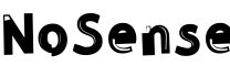
字体参数
以下信息来自字体文件或公开索引,适合下载前快速核对。
- 字体名称
- NoSense
- PostScript 名称
- NoSense
- 字体族名
- NoSense
- 字体风格
- NoSense
- 字符数
- 130
- 文件大小
- 51.26 KB
- 支持语言
- 英语
- 版本
- -
- 格式
- ttf
- 描述信息
- Setting type has been an occupation and a passion of mine over the last 30 years. After completing some schooling at Cooper School of Art in Downtown Cleveland I accepted a position at Peto's Type House. Back then, the Cleveland Press still set type with 'Hot' lead. I know, I know, this dates me, but the facts are the facts. PhotoType was in it's infancy with the Linotronic 5700 being top-of-the-line technology in Photo type setting. My job at Peto's was more modest, among other things, I was hired to set headline type on what was called a 'Typositor'. It was still photo type setting but for headlines only. Letters had to be set (exposed), one letter at a time. A single headline of lets sayÉ15 words or so could take an hour or two to completely finish for paste-up, that's right, I said paste-up. That should really date me!! By doing this day in and day out (for hours on end) I gained a "close-up' appreciation for letterforms and spacing. Ernie Peto would also quiz me on identifying type by name. It was an interesting 18 months to say the least. There have been lasting effects on my appreciation of letterforms thanks to this experience. Over the years, there have been spin offs of wood type, Times Roman, Helvetica, etc. Seems to me like we are just going over the same ground over and over and over again. What interests me is not the 'sameness' in the letterforms or their 'invisibility' in the graphics world. Some fonts are used to be 'invisible'. What I mean by this is that they are merely a communication tool to deliver the authors' / writers' message. the artistry in the forms lies in their ability to stay invisible and be easy to read. But their 'uniqueness' and how that difference translates to the printed page. There are many ways of looking at letterforms. We can look at the beauty of the individual letters themselves. Commenting on the curves of a upper case 'A' or a lower case letterform. Or we can look at them as a 'unit' and how that translates within a block of written text. It is this uniqueness that I am looking for in the fonts I design. I do look at each individual letterform and revel in the beauty of the forms and lines. But I also want to create a Font that when written out will display some unusual and unexpected characteristics when in a large block of text. Look for different line weights and forms in my font glyphs. The idea here is to allow the printed page to display uniqueness in contrast.
- 作者信息
- ©THOMAS CANALE
- 版权信息
- ©THOMAS CANALE, CANALE STUDIO, INC.
版权与收录说明
NoSense 为公开网络索引整理内容,本站不主张拥有该字体版权;相关权利归 ©THOMAS CANALE, CANALE STUDIO, INC. 所有。若该内容不适合继续展示或下载,请通过 zcfont@163.com 联系,我们会尽快核查处理。